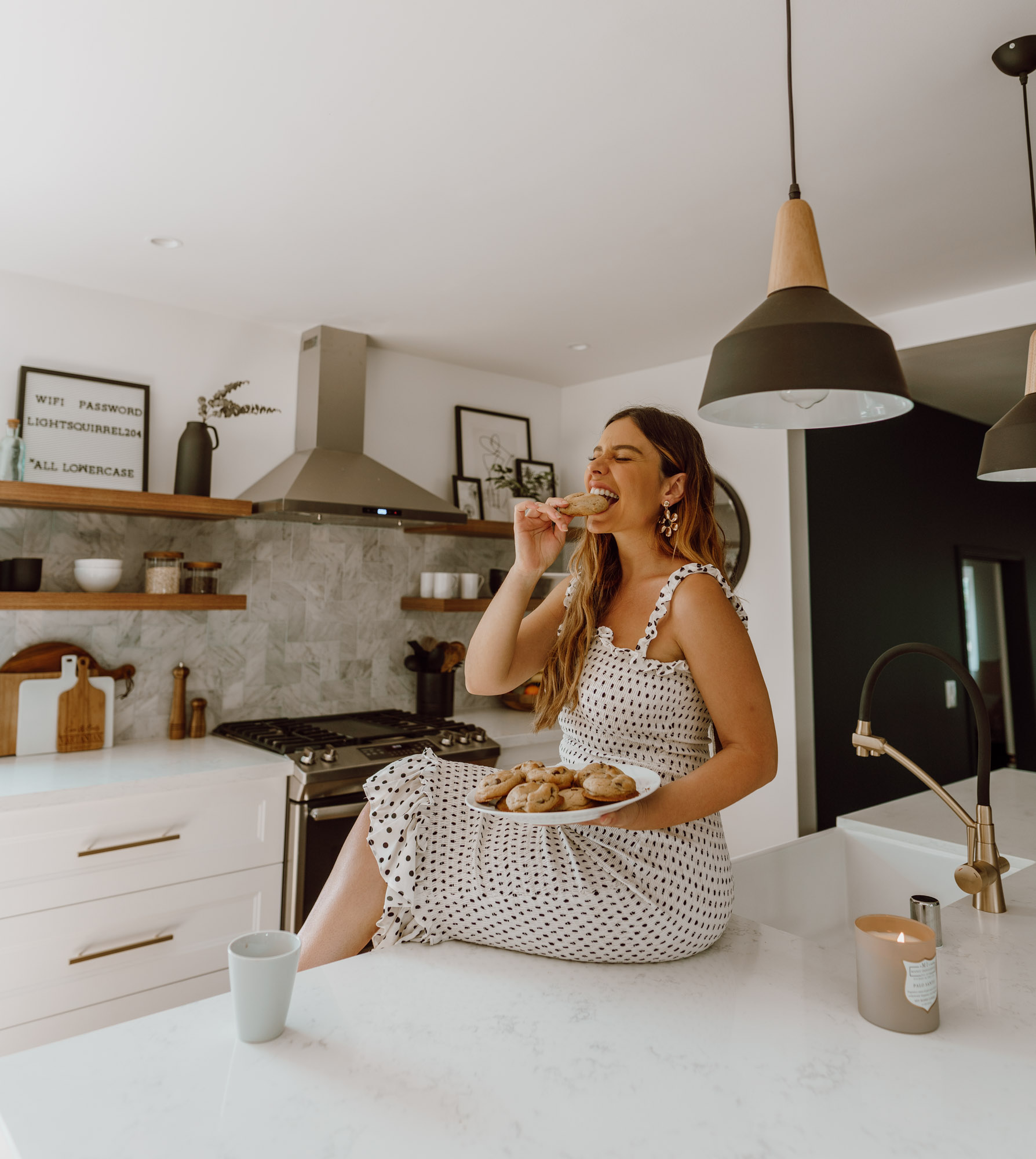
They say the kitchen is the heart of the home…or maybe I just made that up? I’m not entirely sure but OUR kitchen is the heart center of our new home and it’s one of my favorite rooms in the house!
When we first bought our place I was STUMPED on how to remodel the kitchen. The layout was very closed off as most homes from the 40s-50s are. Walls define spaces and we ultimately wanted an open floor plan. But how to rearrange with two walls and a sliding door that took up a large part of a focal wall?
Enter, Paleny of @gilmoregirl_home…as you guys know she helped me with layout and overall design of our place and was the mastermind behind the kitchen configuration!
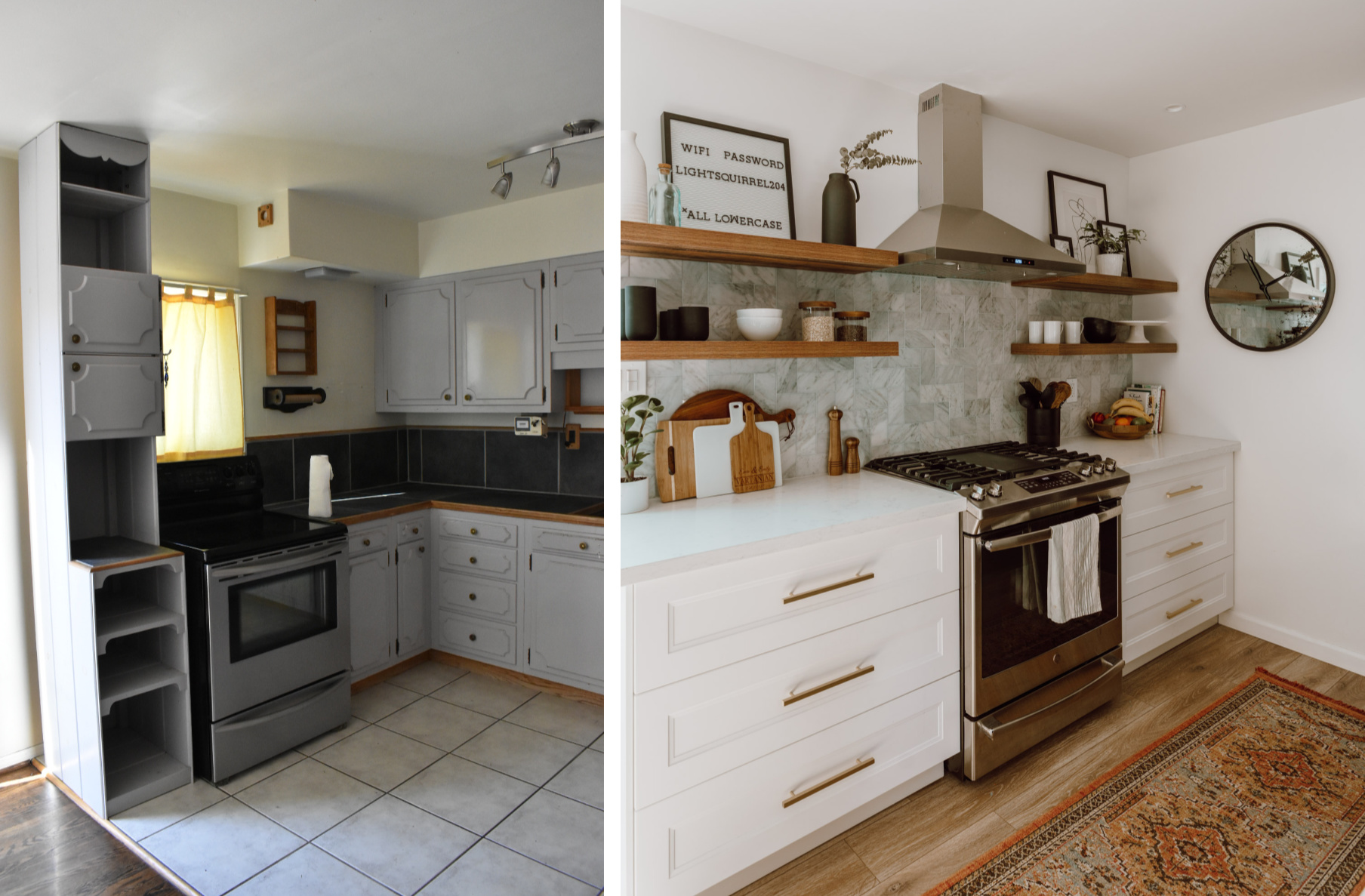
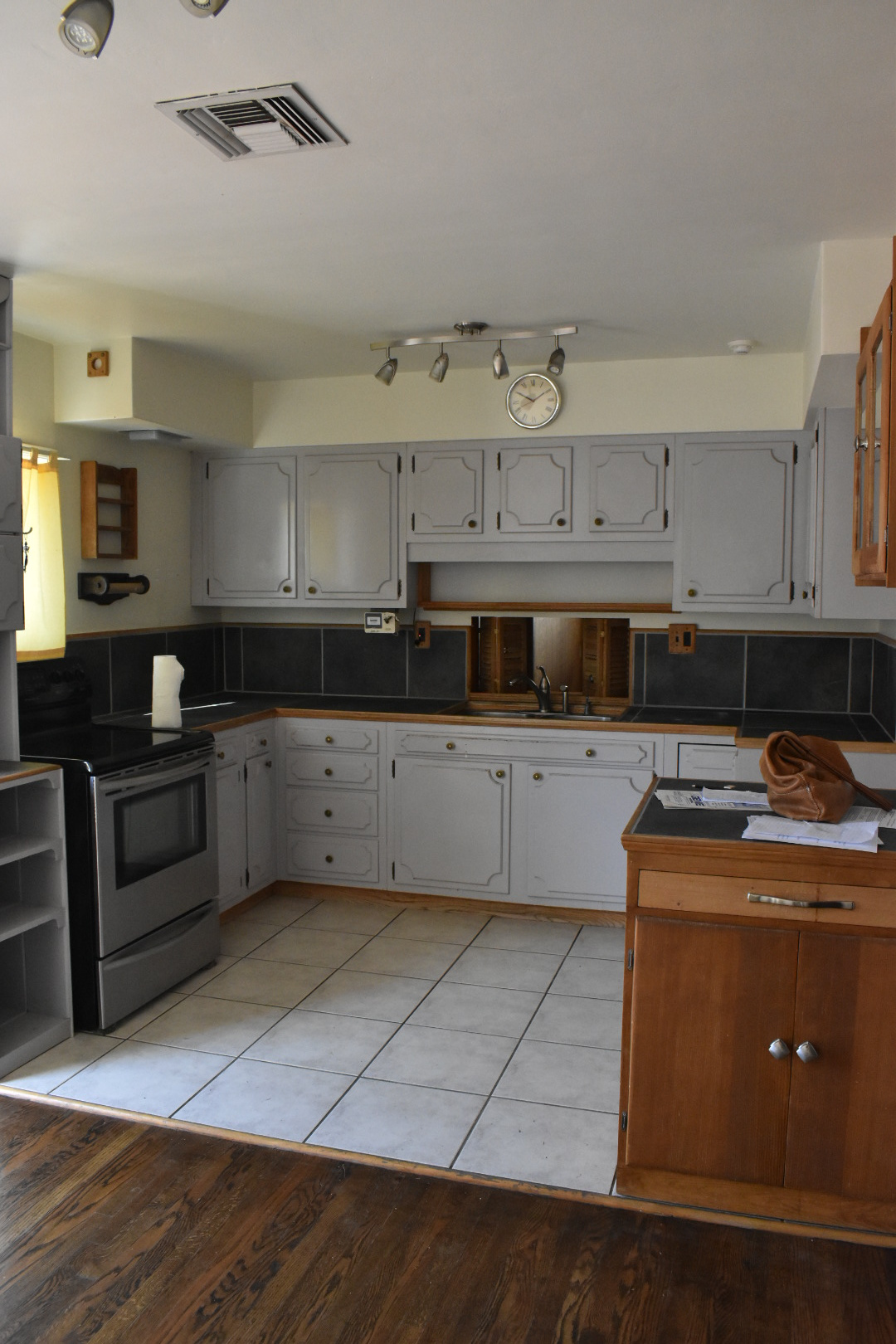
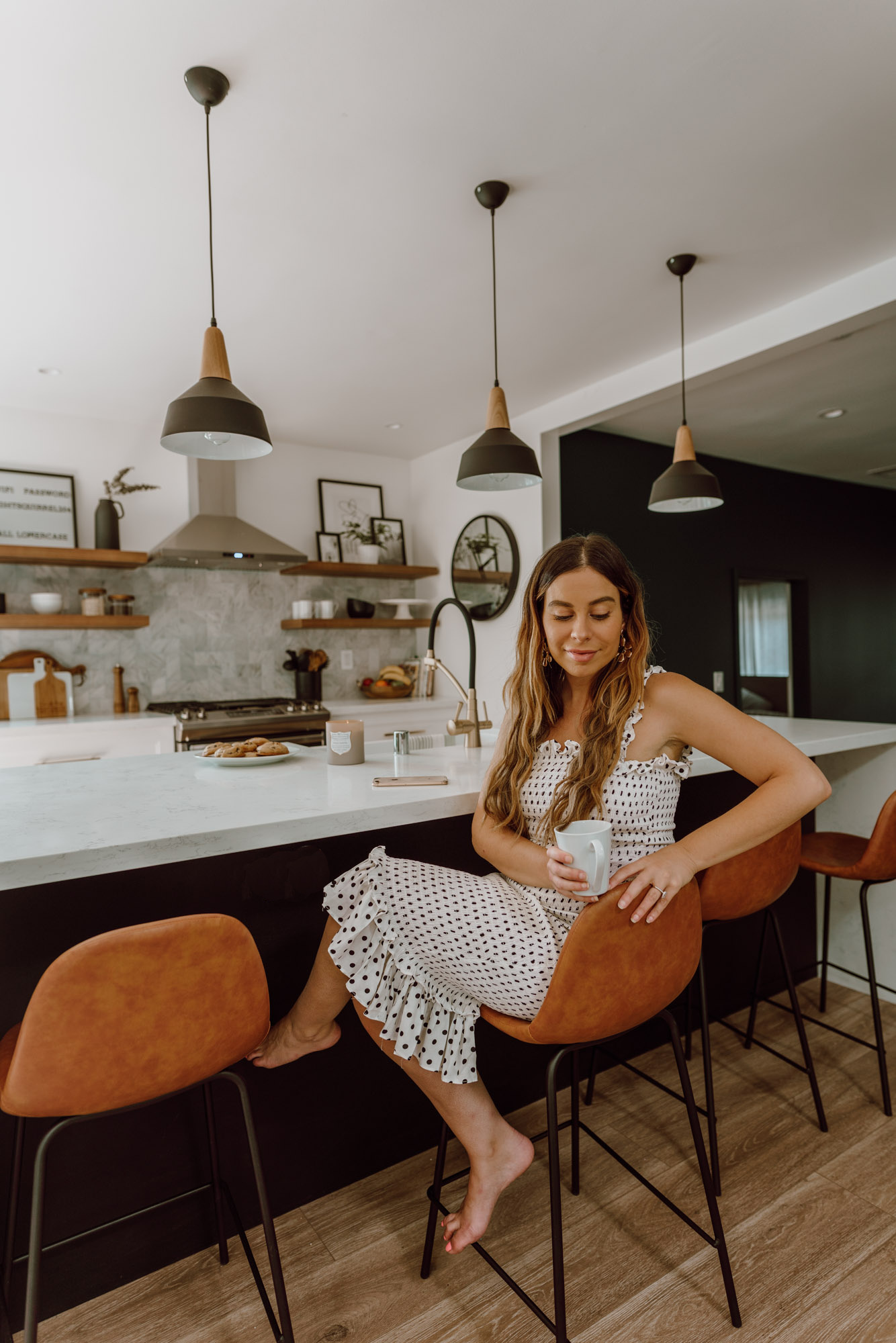
We knocked down two walls to open the kitchen into both the dining room and the living room. Paleny then suggested a massive island in the center that would create a gallery kitchen layout, think two parallel rows of cabinets with a nice walk way in the center. Oven on one side, sink directly facing the oven on the other. The kitchen should be functional first, beautiful second and I’m happy to say we achieved both!
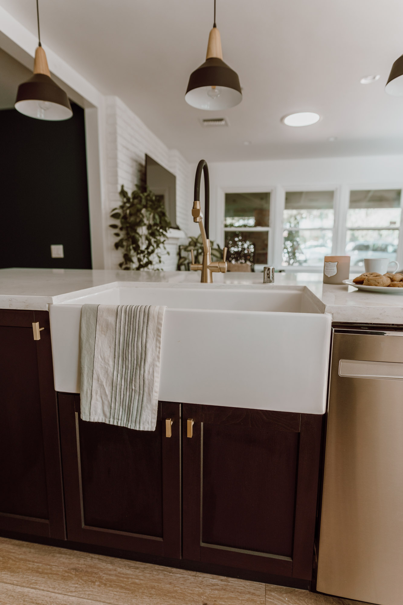
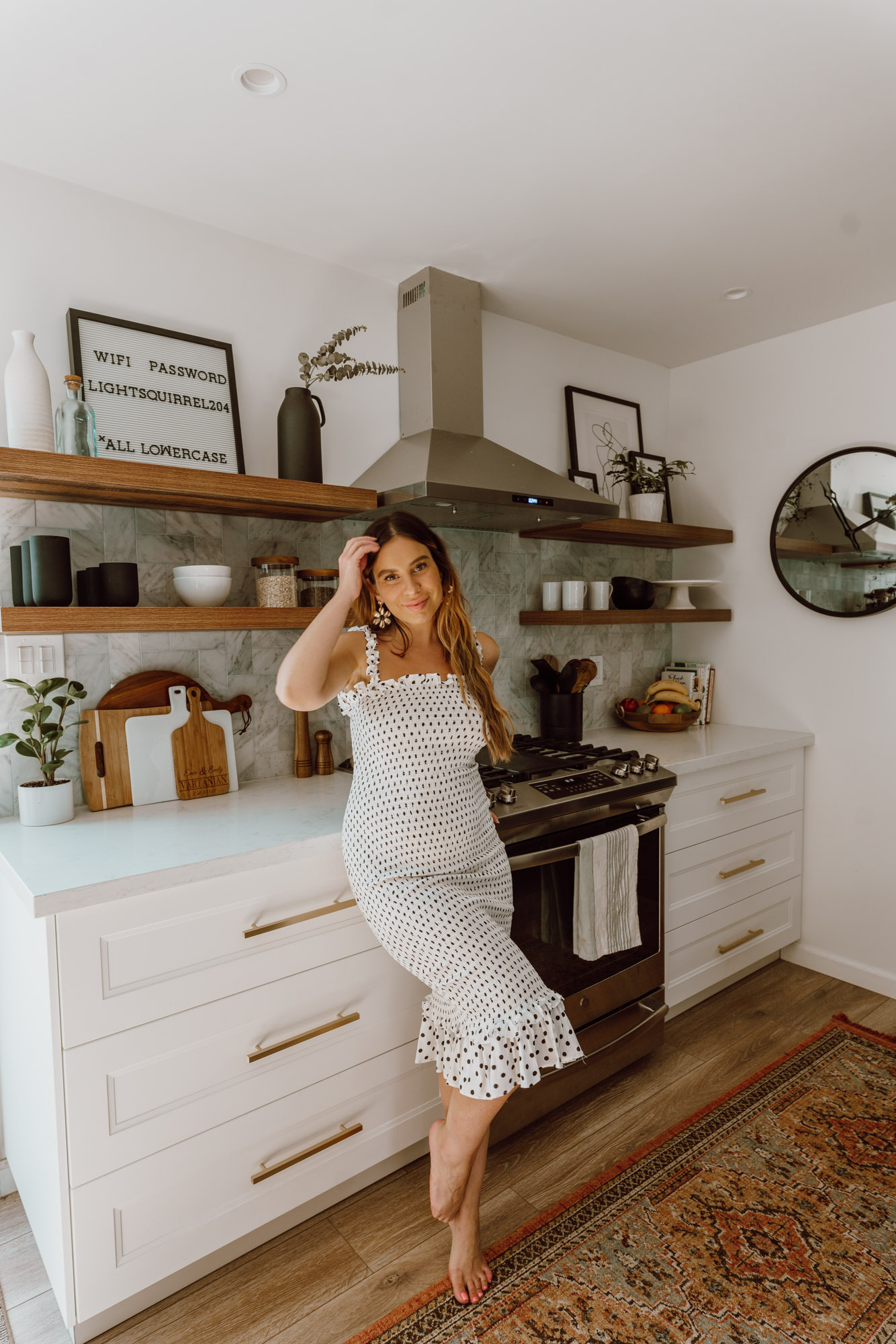
Once the layout was confirmed we dove into the fun stuff – design. I wanted a fresh, modern kitchen that was warm and inviting. I wanted black cabinets, Emin wanted white so we compromised by doing the cabinets against the walls white and the island black. I love the two-tone, it’s fresh yet classic.
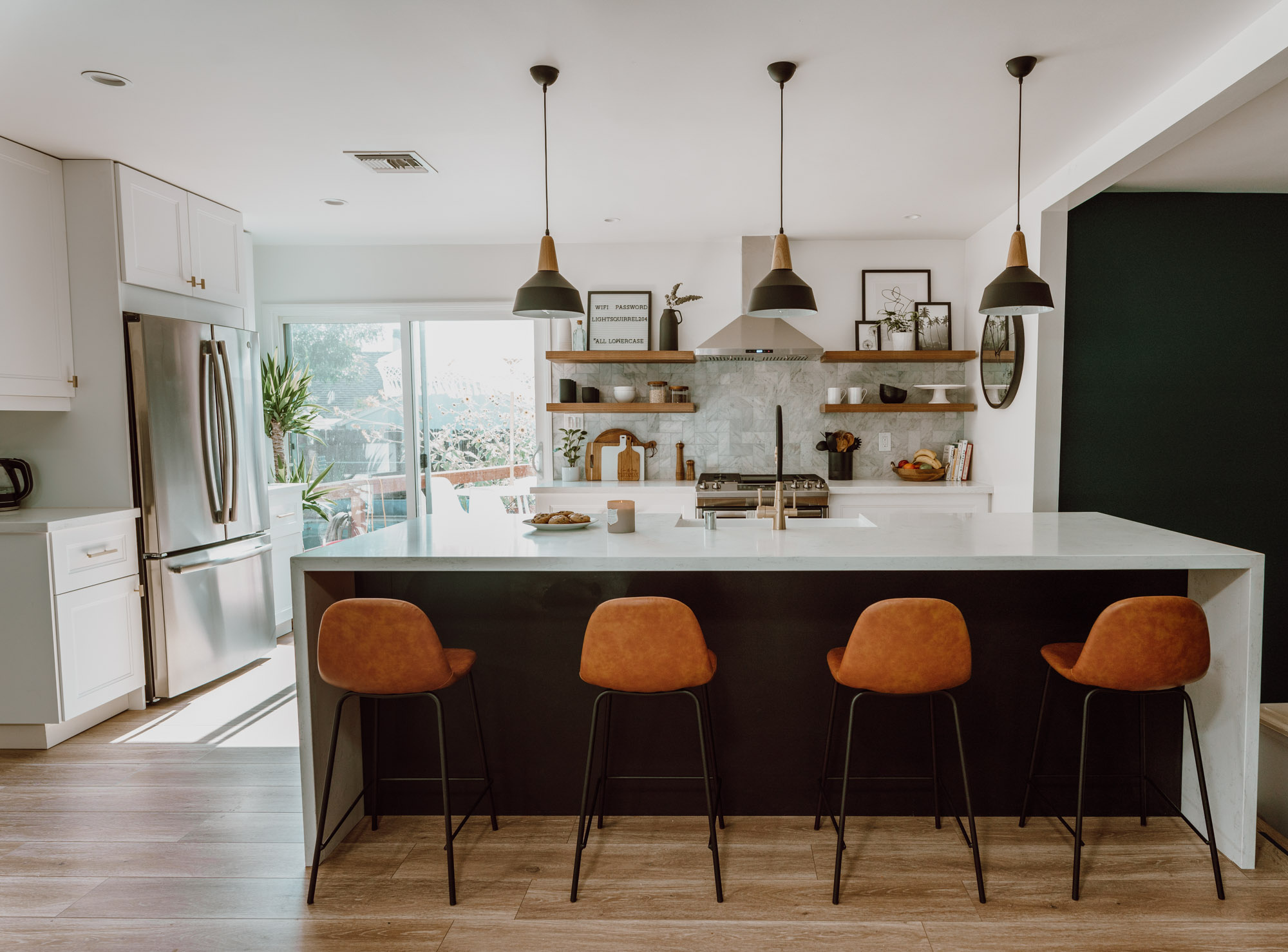
Believe it or not but our cabinets are pre-fab cabinets from Ikea! I had a ton of trouble with Ikea during the remodel process and it was a lot of work on my end figuring out delivery, items etc. but it was the cheapest of all our options and achieved the look we were going for while staying under budget. I wouldn’t suggest Ikea unless you hire Ikea or a certified Ikea builder to build out and install the cabinets from start to finish!
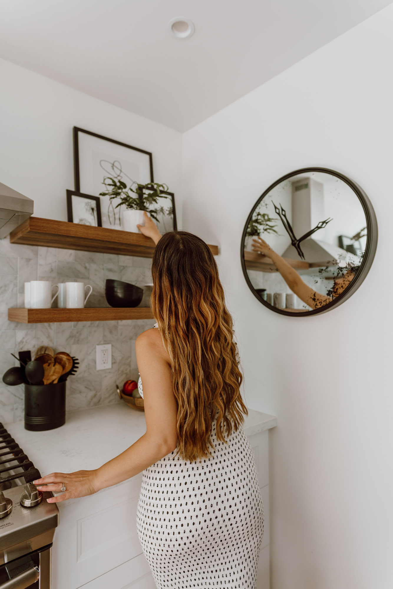
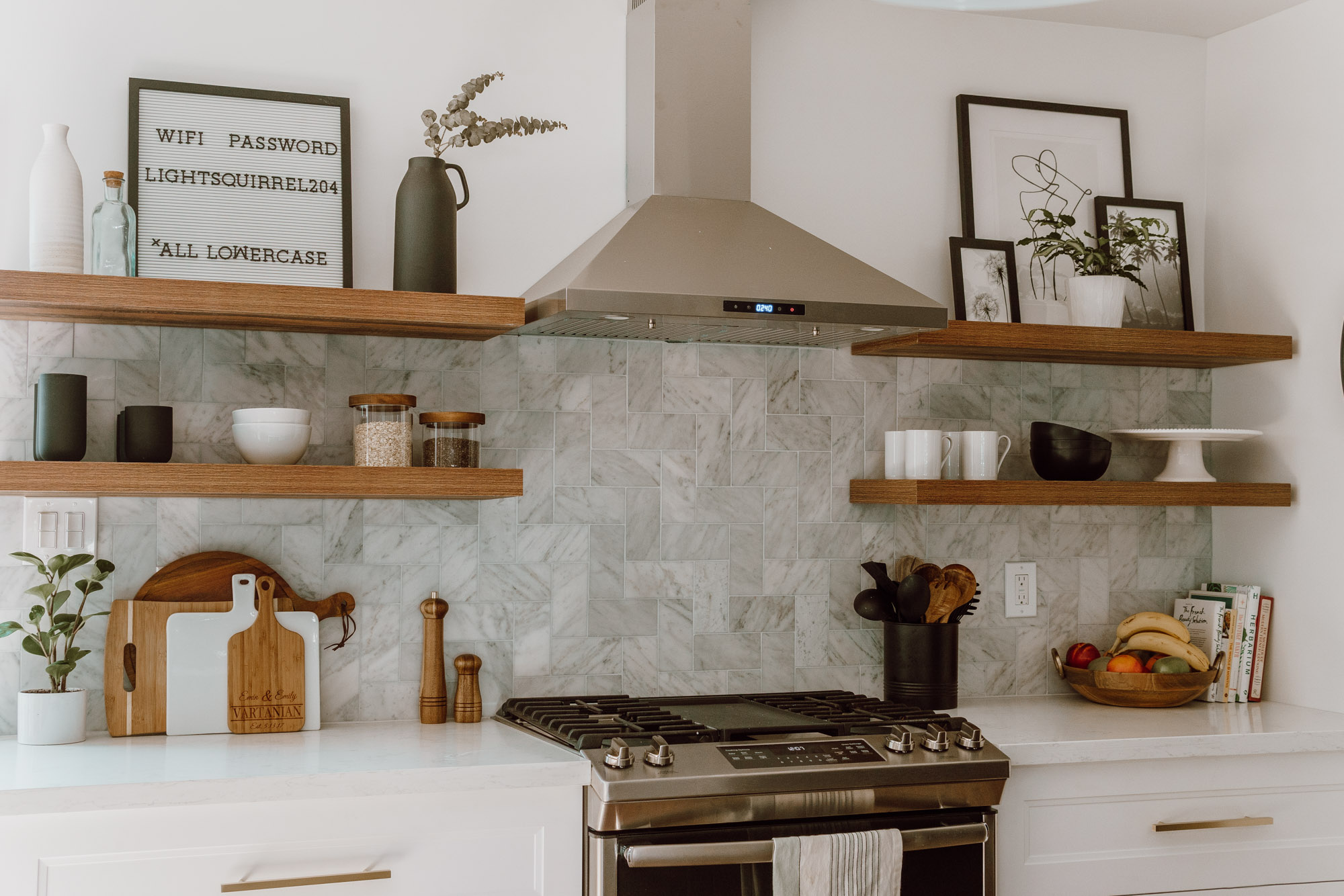
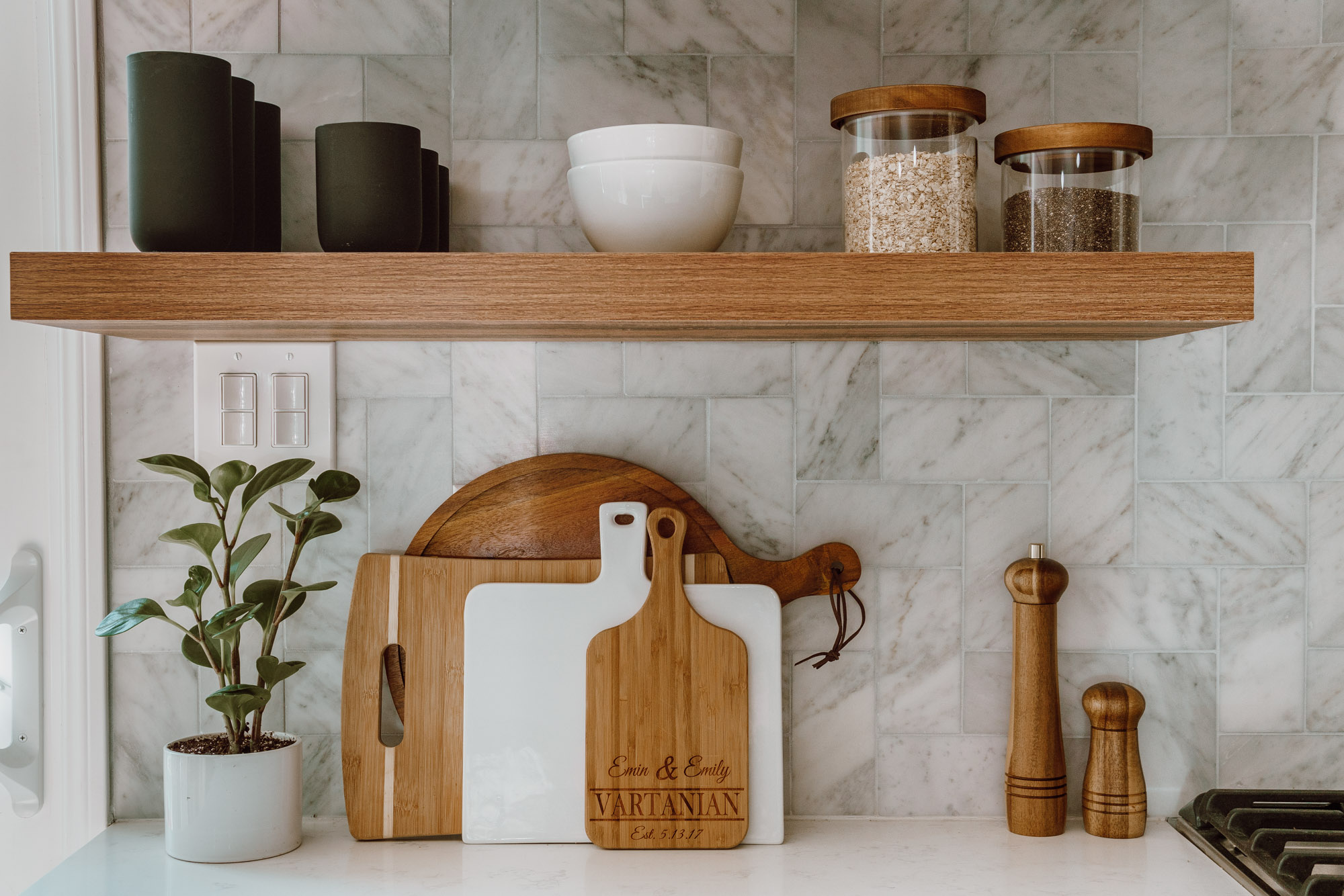
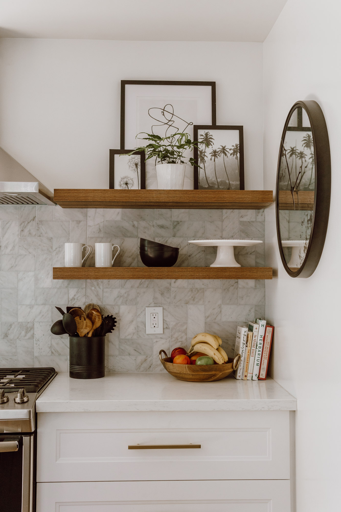
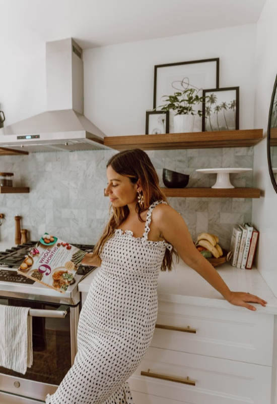
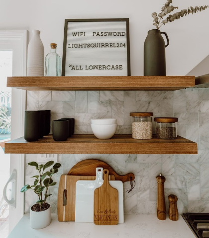
My favorite detail of the kitchen is the backsplash wall and floating shelves. We could have installed standard cabinets but I felt that would close off the space, floating shelves allow the kitchen to feel open and still function as storage space (you just have to think a bit more and make sure it looks pretty).
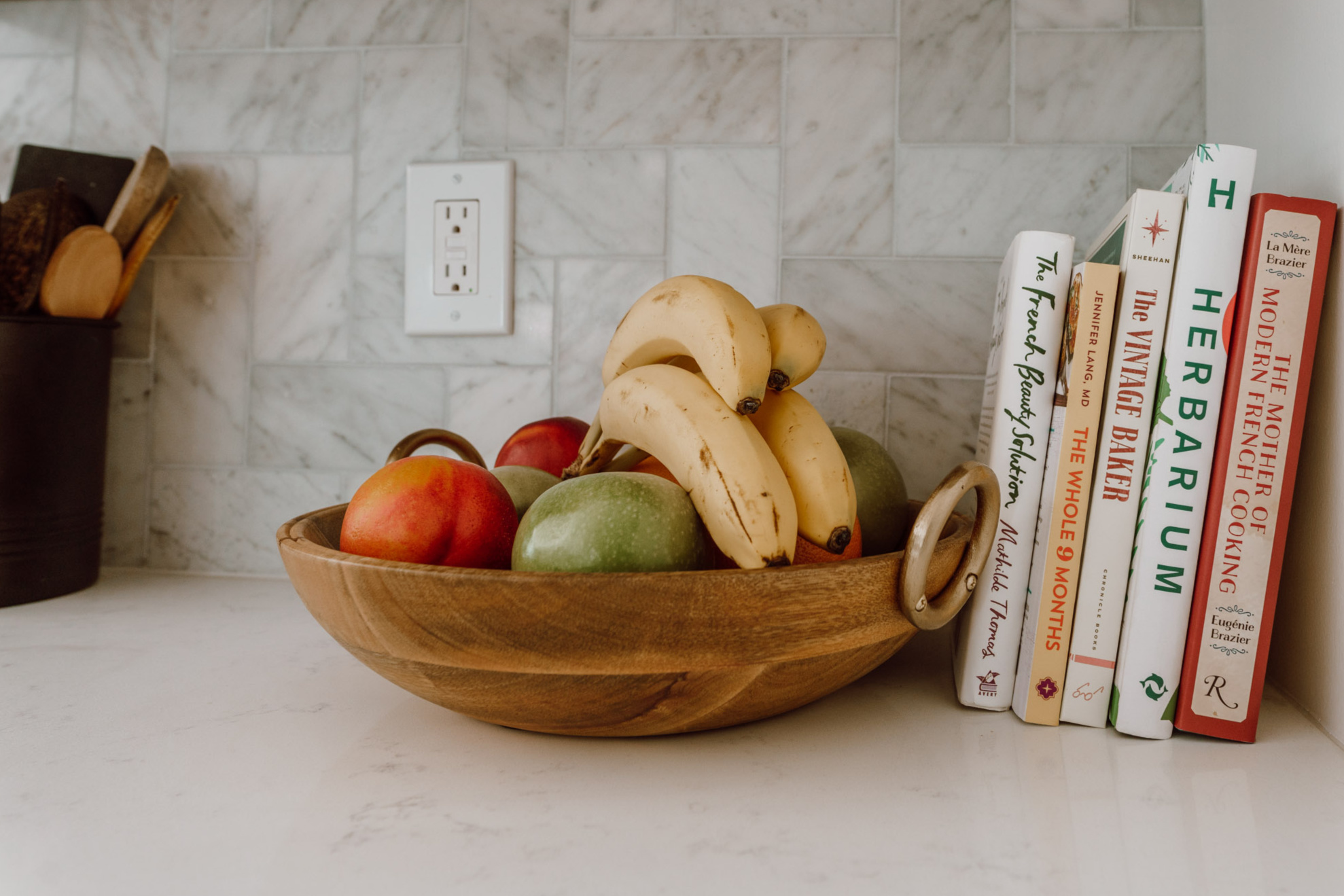
Below are links for the major “it” items from our dream kitchen and I’m happy to say that most items are super, duper affordable!
Black Cabinets – Style Lerhyttan
White Cabinets – Style Axstad
Counter tops – Quartz White Carrera Classic
SHOP THE POST




The new kitchen is absolutely stunning! It is completely unrecognizable compared to the original photos! I love open shelving. I really hope to have it in my house someday. I also really like the two toned effect! It gave so much dimension to your kitchen space.
Jill
https://jilliancecilia.com/