Instagram is a huge part of blogging and continues to be one of the top social media platforms. There are roughly 800 million users on Instagram, every single one of them unique. From regular people sharing their daily life, to mommy bloggers, to fitness gurus – you can literally find anything you are looking for!
In my line of style blogging, Instagram Aesthetic’s are talked about often. But, what is an aesthetic anyway? Well, an Instagram Aesthetic is a certain look or vibe created by a set of gallery images on a feed. The images are cohesive and look like they belong together. They compliment each other in colors, tones and edits. Having an aesthetically pleasing Instagram feed is coveted by many. If you care about the look of your Instagram feed then this post is for you!
So you want a pretty Instagram but you don’t know where to start. My first tip is to figure out exactly what you like. You may be like me and like a lot of different edits but it’s essential to dig deep and really pick one that speaks to you the most. What I would suggest doing is screen-shoting your absolute favorite Instagram accounts and creating an album with them on your phone.
To really nail down an Instagram aesthetic look at the feeds and analyze each of the points below:
-Location – If you live in the city and screenshot five accounts with photos in the tropics it’s going to be impossible to achieve that look because of all the greenery in their photos. And all the white, grey neutrals in yours! Pick feeds with a similar location.
-Outfit Colors – I know this may sound crazy…but if you notice, a blogger with a neutral feed usually wears neutrals. A blogger with a pink-toned feed generally wears pinks, mauves and nudes. Keep the colors you wear in mind if your theme is super specific.
-Whites/Temperature – Really analyze the whites in their photos…are they a cool-blue tint? Warm-orange tint? That will give you an indication of the temperature level of their photos.
-Contrast – Contrast really effects images and it’s what can make a feed look moody, faded or striking. The less contrast a photo has the more faded the photos look. Analyze the level of black and whites in the photo.
-Tint – In Lightroom the tint level changes the overall coloring of the image…literally giving it a tint of color throughout. A lot of color specific feeds tend to use tint…if you look at a feed and see pink overall then chances are the tint is heavily on the pink side.
-Skin-tone – This is one of the harder things to tackle especially if all the photos are of you/people! To have a cohesive feed it’s essential for your skin color and tone to look the same (or close enough) in the photos. This takes huge practice with editing and I will do another post on it later.
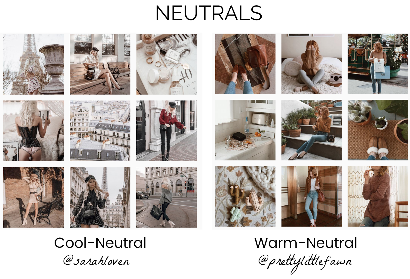
Below you’ll find a breakdown and comparison between some of my favorite accounts. Notice how I’ve categorized them into different buckets and then split them into two styles based on tint, contrast, saturation etc. (disclaimer: these are just a few styles of Instagram feeds, there are tons more!)
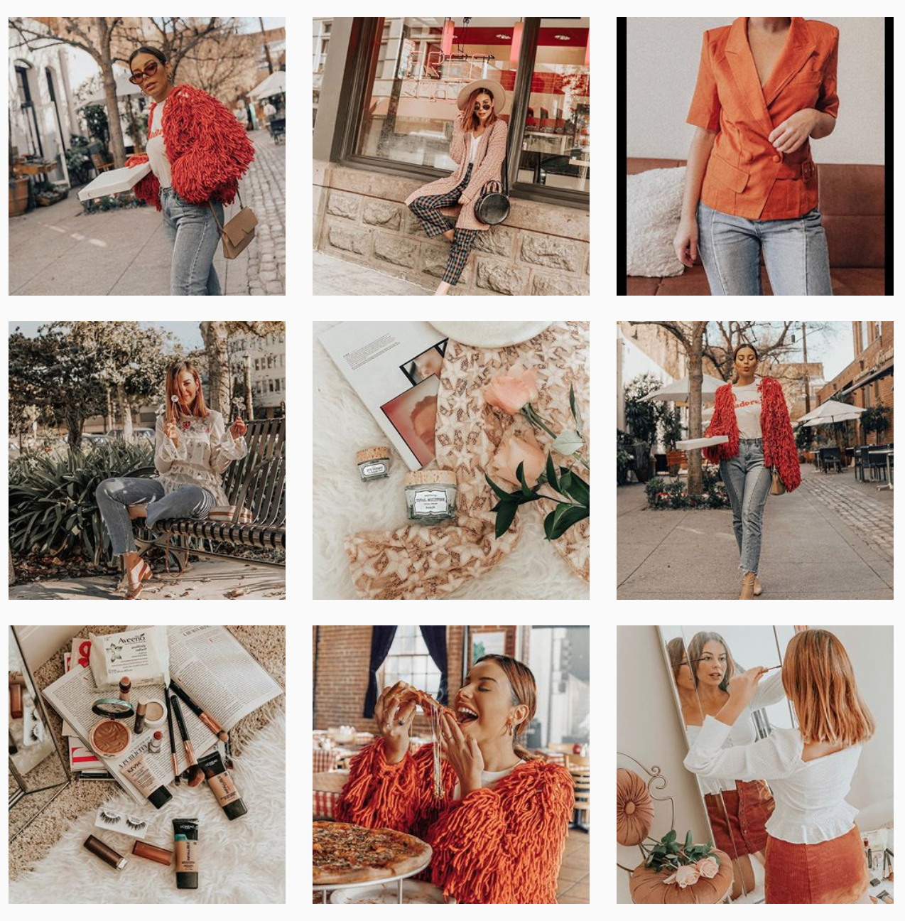
My personal aesthetic changes as often as I change my underwear (ok maybe I’m exaggerating a bit) but I am still trying to figure out EXACTLY what I like too! Sometimes I want my photos to be super warm-orange and sometimes I like them to be less saturated. Right now, I would consider my feed to be a colorful aesthetic with a warm-orange tint and high saturation.
As most things it all takes practice and patience! Keep editing and getting into a groove with your photos…you’ll get your Instagram look in no time!
xo
EV








UGH, this was helpful, but I’m having the hardest time because my wardrobe is all over the place too…. Is it possible to achieve the same aesthetic if you are constantly changing locations? I.e. city vs. tropical vs. desert. and then on top of that shooting at different times of the day?
This is really helpful! Now I just need to sit down and figure out what feels like “me”.